![mursion_mark_full-color_standard_1000pxw.png]](https://support.mursion.com/hs-fs/hubfs/mursion_mark_full-color_standard_1000pxw.png?height=28&name=mursion_mark_full-color_standard_1000pxw.png)
This article applies to the newer Admin experience (Your dashboard has a white bar with the M logo at the top)
If you are using the legacy admin dashboard (Your dashboard has a blue navigation bar at the top), please see this article.
Accessing the dashboard
- Log in to your Mursion admin account.
- Select Analytics from the left navigation pane.
- The dashboard loads automatically with your most recent data, on the Adoption and Performance tab.
Filtering your view
Every chart on the Overview tab responds to the filters at the top of the page. You can look at your numbers broken out by:
- Pathway
- Cohort
- Simulation type — AI-powered or human-powered
- Session Date Range
This gives you the flexibility to look at your numbers in whatever way makes sense for your organization.
Note: the pathway completion metric (in the Participation funnel section) is not affected by the Session Date Range filter. It always reflects your current overall completion status — not just activity within your selected window — so don't be surprised if it doesn't move when you adjust dates.
At a glance

Your top-line summary — if you only have 30 seconds, this section gives you a good indication of how people are engaging with Mursion:
- Participants with access — everyone who has access to the pathways, cohorts, or simulations currently in view
- Engaged participants — participants who have completed at least one session
- Total completed sessions — completed sessions within the date range
- Avg sessions per engaged participant — average sessions per participating person
- % reaching Goal Achieved — the percentage of participants achieving the goal of their scenario(s)
Participation funnel

Shows how participants move through the pathway lifecycle: are they assigned to a pathway, have they registered, are they in progress, and have they completed the pathway — meaning they've completed every scenario in the pathway at least once.
- Progression by cohort — the same lifecycle detail broken out by cohort, so you can see which cohorts are progressing through the pathway differently.
- Biggest engagement gap — surfaces where the largest share of participants are stalled, and what percentage have completed the pathway.
- Trend over time — the same funnel data plotted over the last several months (or whatever window you select), so you can see how progression is trending.
Repeat practice on the same scenario
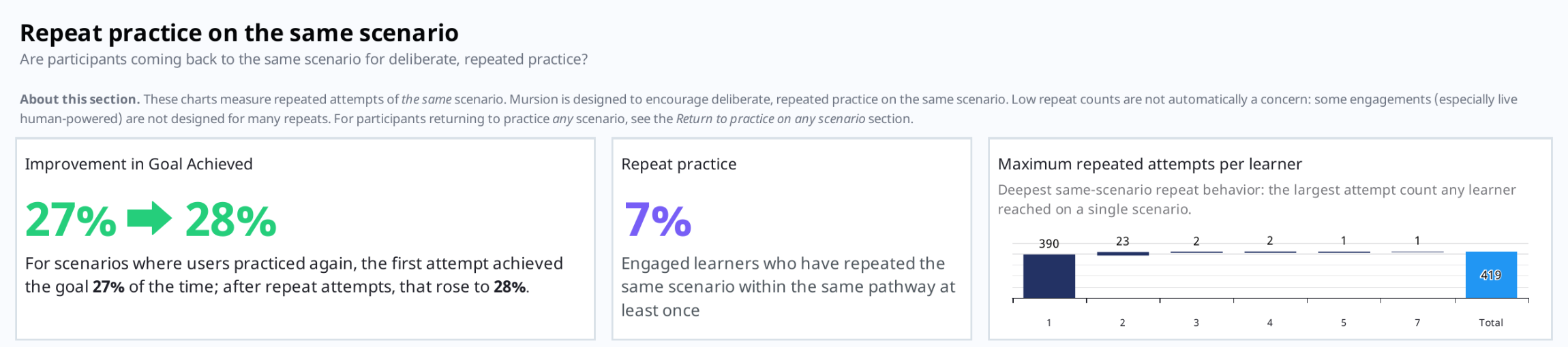
Answers a specific question: are participants coming back to practice the same scenario? Deliberate repetition is core to how Mursion builds skill, so this section tracks it directly.
- Improvement in Goal Achieved — what percentage of users improve from their first attempt to their second attempt on the same scenario.
- Repeat practice % — how many participants are engaging in repeat practice at all.
- Attempts by participant, by scenario — a breakdown of how many attempts participants are logging per scenario.
Good to know: it's normal to see relatively low repeat-practice numbers, and that's not automatically a red flag. It can simply reflect how your pathways are structured, or where you are in the pathway's lifecycle — if it's still early, participants may not have had the opportunity to try a scenario multiple times yet. Use this section to see whether repeat practice is happening, how it's helping when it does, and where in your program it's concentrated.
Continued engagement & pathway progression
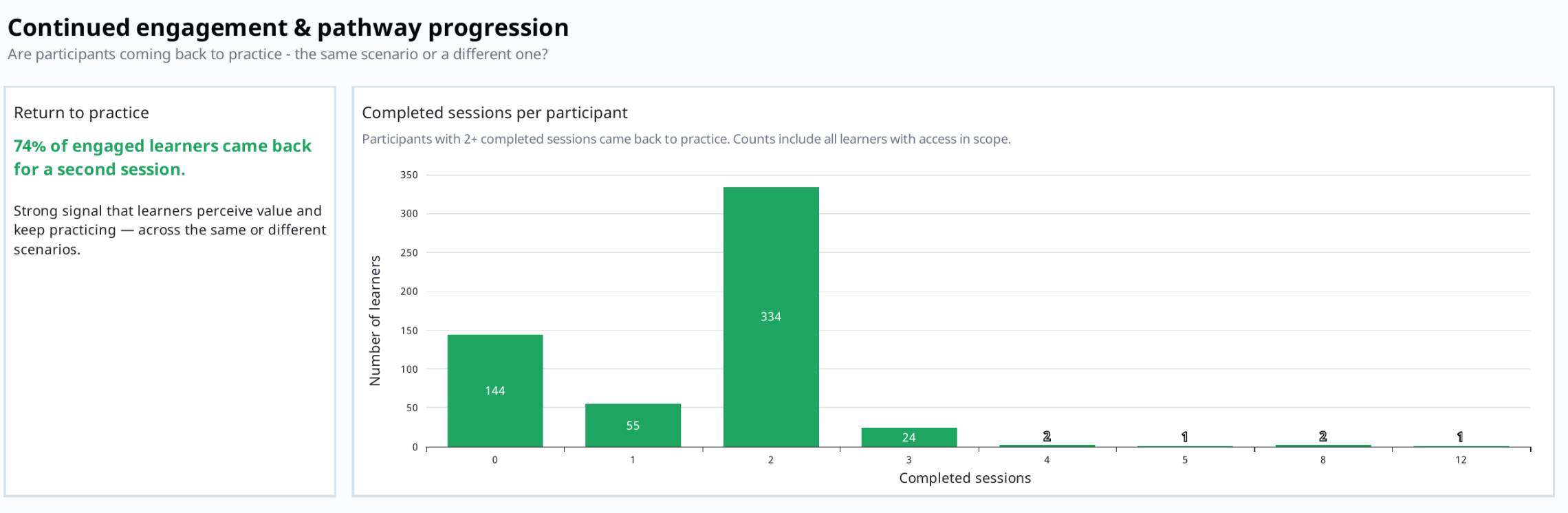
Asks the same type of question as the section above, but at a broader scale: are participants coming back to practice — across multiple scenarios or sessions, regardless of which specific scenario?
This is a good indicator of how people are progressing through a pathway overall. For example, if your pathway has three scenarios, you'll want to see a high "return to practice" number here — it means people are coming back and actually completing those simulations, not stalling after the first one.
Skill development
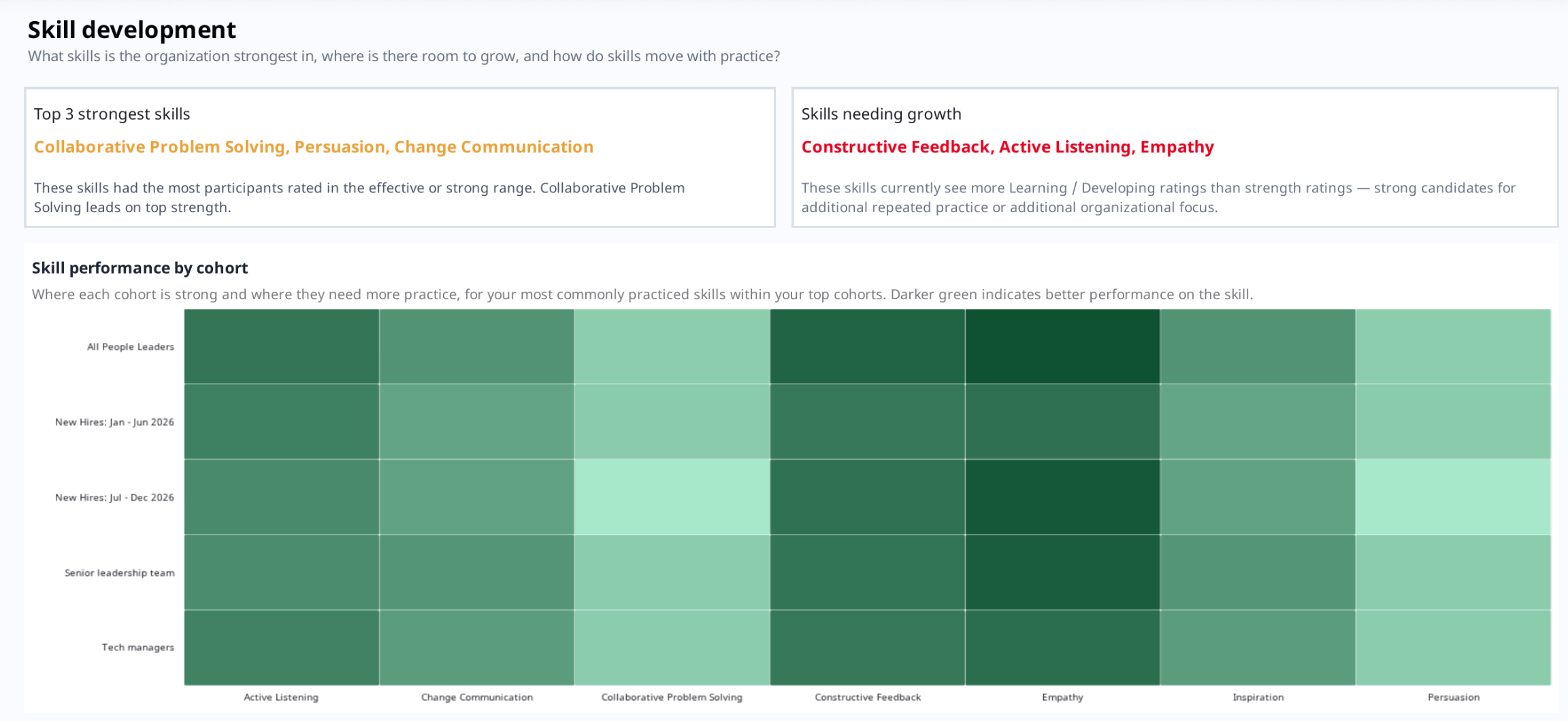
One of the most useful sections for planning team development. It shows what skills your organization is strongest in, where there's room to grow, and how skills move with practice.
- Top strongest skills and skills with the most opportunity for growth — called out directly at the top of this section.
- Skill performance by cohort — a heatmap of your most commonly practiced skills within your most active cohorts. Lighter green marks opportunities; darker green marks strengths.
- Skill ratings by proficiency level — every skill a participant practices in a simulation is rated on a four-point scale: Learning, Developing, Effective, and Strong. This chart shows how those ratings break down across your participants.
- First rating vs. best rating — shows how ratings change between a participant's first attempt at a skill and their best attempt at that same skill.
- Skills showing the greatest growth — the skills with the biggest average gain between a participant's first attempt and their ultimate best attempt.
Momentum & trends
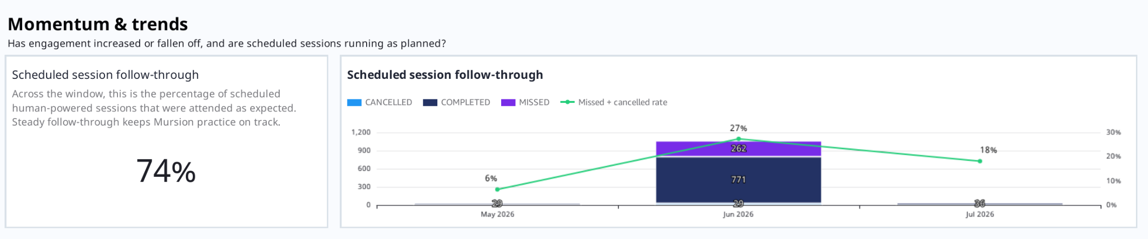
Especially useful if your organization uses human-powered simulations. This section shows whether participants who schedule sessions are actually showing up for them.
- Scheduled session follow-through — you'll want this number as high as possible; it tells you that when someone schedules a session, they follow through and attend it. Track it over time to catch any shift in participant behavior early.
Scenario outcomes
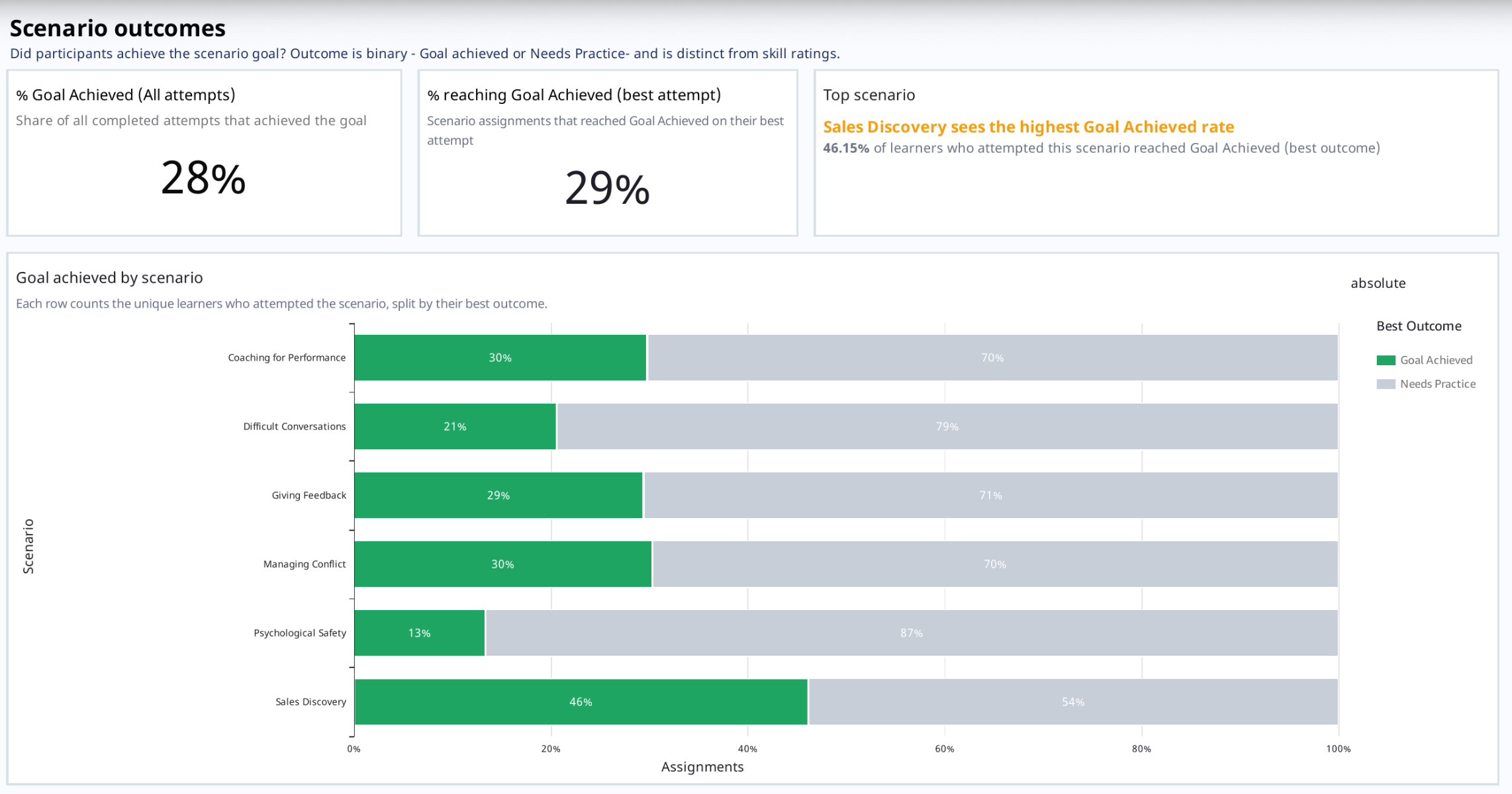
Shows how participants are doing on each scenario.
- % Goal Achieved (all attempts) and % Goal Achieved (best attempt) — the first reflects the average outcome across every attempt logged; the second reflects, per participant, what share are ultimately able to demonstrate the scenario successfully. These two numbers align closely with the improvement figure in the Repeat Practice section, but give you a fuller picture from two different angles.
- Top-performing scenario — which scenario is achieving the best outcomes.
- Goal achieved by scenario — best outcome per participant, broken out scenario by scenario.
- Cumulative and month-to-month trend — goal achievement over time; expect this cumulative number to trend upward as your program matures.
User and Session Data Tab
The second tab gives you more granular, participant- and session-level detail — including the ability to export data.
- Uses the same Pathway and Cohort filters as the Overview tab.
- Pathway status table — every participant with access to a pathway, their current status (Assigned, Registered, In Progress, or Completed), and how many scenarios they've completed within that pathway. Add a Pathway Status filter to narrow this down — for example, filter to "In Progress" to see exactly who hasn't finished all their scenarios yet, and how far along each of them is.
- Session-level table — every session that occurred within your selected pathway, cohort, and date range: the scenario, the date it happened, the pathway, the session status, the cohort, and the participant's email address.
- Export to Excel — any chart or table on this tab can be exported. Click the three-dot menu on a chart and select Export to Excel to download the underlying data — useful for pulling a list of specific participants (for example, everyone still in progress) to follow up with directly.